The mobile web is becoming more and more important with each passing day, each new smart phone, and each new data plan phone user. The mobile internet can no longer be ignored as an important marketing venue.
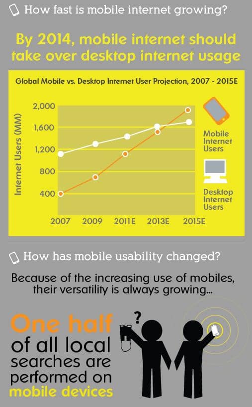
As you can see by this graphic, it is being predicted that mobile internet usage will overtake desktop internet usage by 2014–less than two years from now! Businesses that refuse to adapt to the changing technology will not only BE left behind–they are already being left behind, as you can see that even today, one-HALF of all searches are being performed on mobile devices! The speed of this technology adaptation is just incredible!
Benefits of having a mobile version of your website:
- Faster loading than full website on mobile device because it is less graphically intense
- Choose the information you want your mobile readers to view when they arrive
- Clear, simple navigation
- Larger font size upon entry for easier reading
- Ability to enlarge text to preference of the reader with a simple hand motion
- Portability allows content to be accessed anywhere a mobile device has a signal
- Competitive advantage over competition without mobile websites
- Offline interaction with QR Codes
- Natural integration with social networking websites
- Improved Search Engine Optimization, especially in the mobile website category
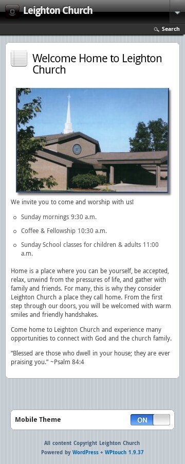
A mobile version of your website is a simplified, less graphically-intense version of the website. All the text and images will appear, but the design is lighter and quicker to load. The image below to the left shows the Home Page.
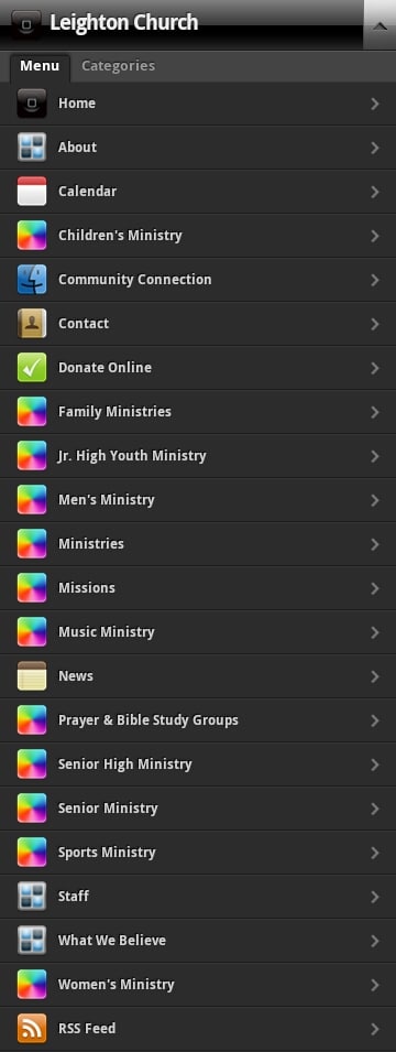
When you click on the arrow in the upper right-hand corner, the menu drops down, as shown in the image on the right. From here, your mobile visitors can choose the page that he/she would like to view.
If you have a blog on your website with Categories, you can see there is a tab on the Menu where visitors can view your postings by category.
On the left, you can also see that your visitors can view the regular website by clicking the On button to the Off position.
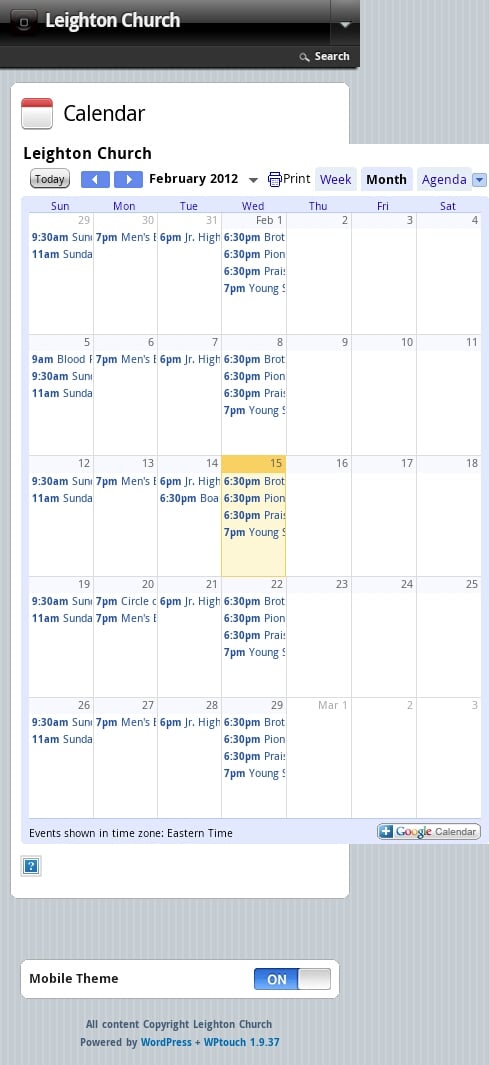
Below, to the right, you can see the Calendar page. To view an individual Day, Week, or Month is only a click away. You can also click on the individual event for more information.
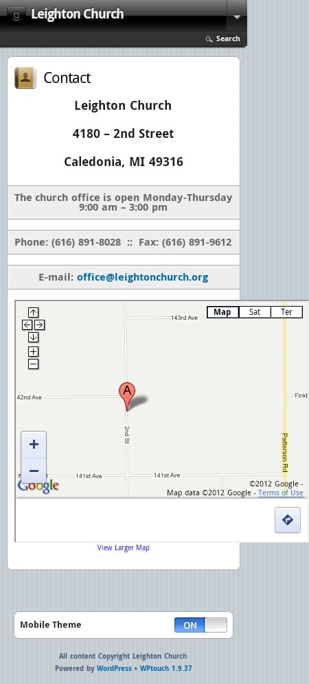
To the right, you can see the Contact page, with all pertinent information and an interactive Google map.
I just chose a few sample pages to show how your mobile website can look. You can choose the pages that you want displayed in the Menu, and leave off others, if you choose.
Smartphones (iPhone, Android, & Blackberry) will recognize that you have a mobile website and show it, instead of the regular site.
If you have a WordPress site with Dramatic Design, this new option is available to you. If you aren’t sure if your website is a WordPress site, just ask!
So, what if you don’t have a smartphone? That doesn’t matter—your website isn’t there for you, it’s there for your customers and we’re trying to reach those customers in the way that is convenient for them. After all, that’s what marketing is about, right?
This offer is available to current and new Dramatic Design WordPress clients for a nominal, one-time fee.
If you’d like to add a Mobile website to your marketing toolbox, please drop me a note and I’ll get that up and running for you!
Complete infographic located at: https://pinterest.com/pin/159455643026652228/
